This week on The Terrible Anvil, we talked about BACKGROUNDS! When and How and Why to draw them, maybe also hopefully indirectly answering Oneita's great questions from the pre-call post over in Comics FLOW and PUBLISH:
"Personally love backgrounds and I like having them in my comics but I tend to get lost between deep perspective and foreground objects. I’m not wanting to take away from my characters but I also want to have more than a blank throwaway type environment. I’m often weighing how much detail in the background? How do I make my characters pop? What’s most important ,words or the characters or the silence?"
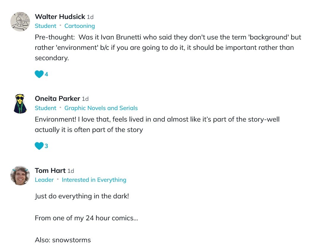
(Some other great comments from the pre-call post!)
We talked about the link between last week's topic, EXPECTATIONS and backgrounds: what we THINK backgrounds should look like, as well as what readers might expect, hence this fun John Byrne example of a fight in a snowstorm:
Jess mentioned that OBJECTS can also serve a similar purpose to backgrounds and that, as also is the case in improv theater, and also perhaps radio theater sound-effects (thanks Walter Hudsick!) that objects can be CHARGED WITH NARRATIVE. (aka PROPS!) And thought of the value of words and pictures paired together: when the caption says "We're back at the spaceship command room" and the panel has a steering wheel, I know that is the steering wheel to aforementioned spaceship and not a Honda Civic.
Regarding expectations of what backgrounds (and maybe also comics) can or should do, it's often thought that backgrounds should be IMMERSIVE and REALISTIC. Tom and Jess underlined the idea that one can draw comics that are immersive without being explicitly detailed or realistic. Something that Jess will often refer to as ART BUDGETING - asking each panel how much and what kind of information it wants to impart, and to what end. Every panel is a choice - the ones preceding and coming after inform that choice as well. You get to decide how and when to make something look a certain way, or what to emphasize.
Carole McKee Armen mentioned the backgrounds of KrazyKat and how they frequently change, and Tom added how that approach impacts the storytelling and narrative itself.
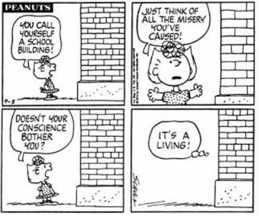
Tom mentioned the minimal backgrounds of Peanuts and how that shaped how he often would draw backgrounds when starting out. This example of Sally kicking the school building was a recurring scenario that Tom loved.
There's lots more on this episode! Tune in on our YouTube channel and listen wherever you stream your podcasts.
Happy Making!
Jess (+ Tom)


Share this post