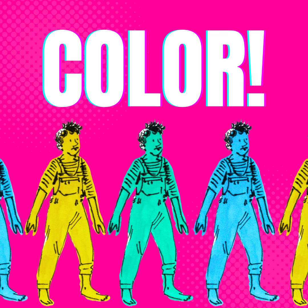
This week on the Terrible Anvil, we parsed one of Jess's favorite topics: COLOR!!
(Watercolor illustration by Jess!)
Here's a quick look at our tips for approaching color (in comics or otherwise) as a newbie:
Pick just one color at first, especially if working in a new medium/with new tools. If that's not interesting, try two colors, maybe three. By using limited color palettes you will gain confidence and figure out what works with color!
Are you color confused? Color curious? When in doubt, think about CONTRAST! Jess's hot take: if something is the 'right' value, it doesn't really matter what color it is.
Err on the side of a lighter color: reading the lines and artwork/what is happening in the panel is more important than the color itself.
Start with an "anchor" color: if something NEEDS to be a certain color (nursing scrubs in Jess's hospital comics are seal blue, for example) start there. Then each choice after that informs the rest of the palette.
Steal a palette from a comic you love!
There's more to love and learn in the full episode, so give it a listen!
Aaaand join us next week for our next (penultimate??) episode, where we'll talk all about DIALOGUE! (and scripting and writing comics!)
You can watch the call live by joining the SAW FLOW + PUBLISH member group, where you'll also get access to a supportive community and expert guidance on getting your comics published! Sign up here: https://learn.sawcomics.org/courses/comics-flow-group
Until then, happy making!
💬 DONATIONS SAW Comics is a 501C-3 non-profit and we thrive on your support and donations to keep arts education accessible!
You can support us on:
➡️ Patreon: / sawcomics
➡️ PayPal: https://learn.sawcomics.org/pages/donate
➡️ Or become a sustaining donor: https://learn.sawcomics.org/courses/s...
Thank you for being here!


Share this post