Reading the Magic Treehouse graphic novel with my daughter I noticed some really nice pages, and thought I would point them out. Good visual communication and storytelling here!
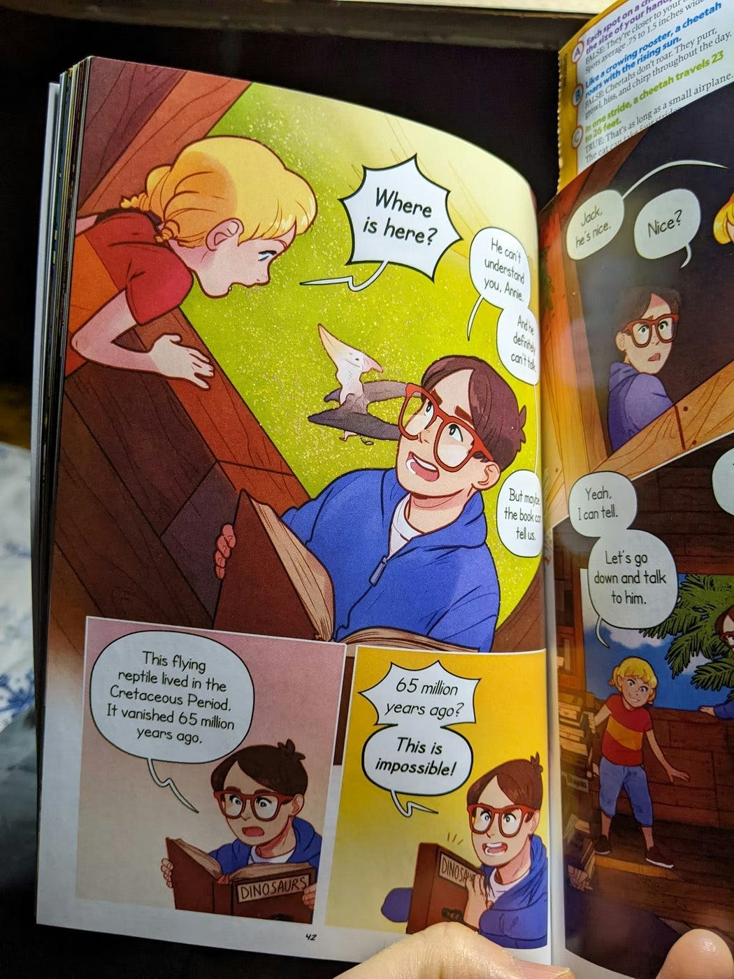
First, the artists (a brother/sister team, I think) use tilted (sometimes called “Dutch”) angles really well, to both add variety but also make "better" compositions (where everything fits without any dead space.) This page is a good example.
That first angle adds to the drama, emphasizes how exciting and weird this moment is, keeps us in the treehouse, but also drives us into the two panels of exposition, which could be boring, but now feels like a rest from the intensity of the tilted panel.
That first panel also just fits all the elements (girl, boy, flying dinosaur, plus dialogue) really well, better than if it were straight on.
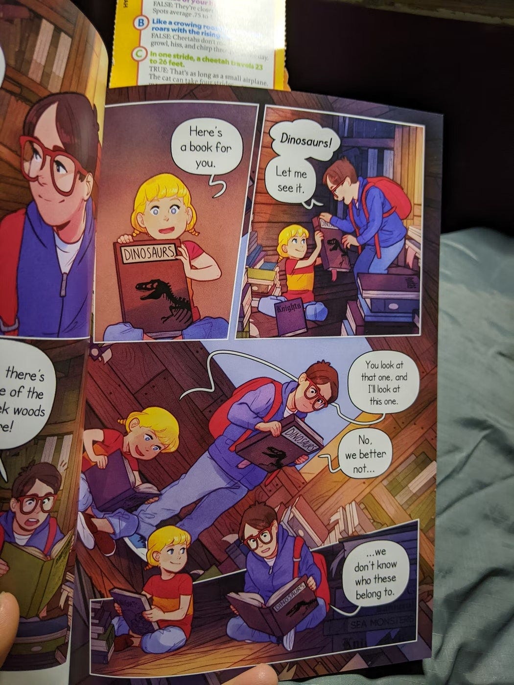
This next one is similar, even better. Good use of tilted angle. That third panel would have been dull if it were straight (there would have been lots of dead space by the dialogue), plus things are still weird in the story, so this angle keeps us a little bit on our toes.
Plus the way the next panel is ever so slightly tilted the opposite way encourages a little return of equilibrium as we finish this page. It's great!
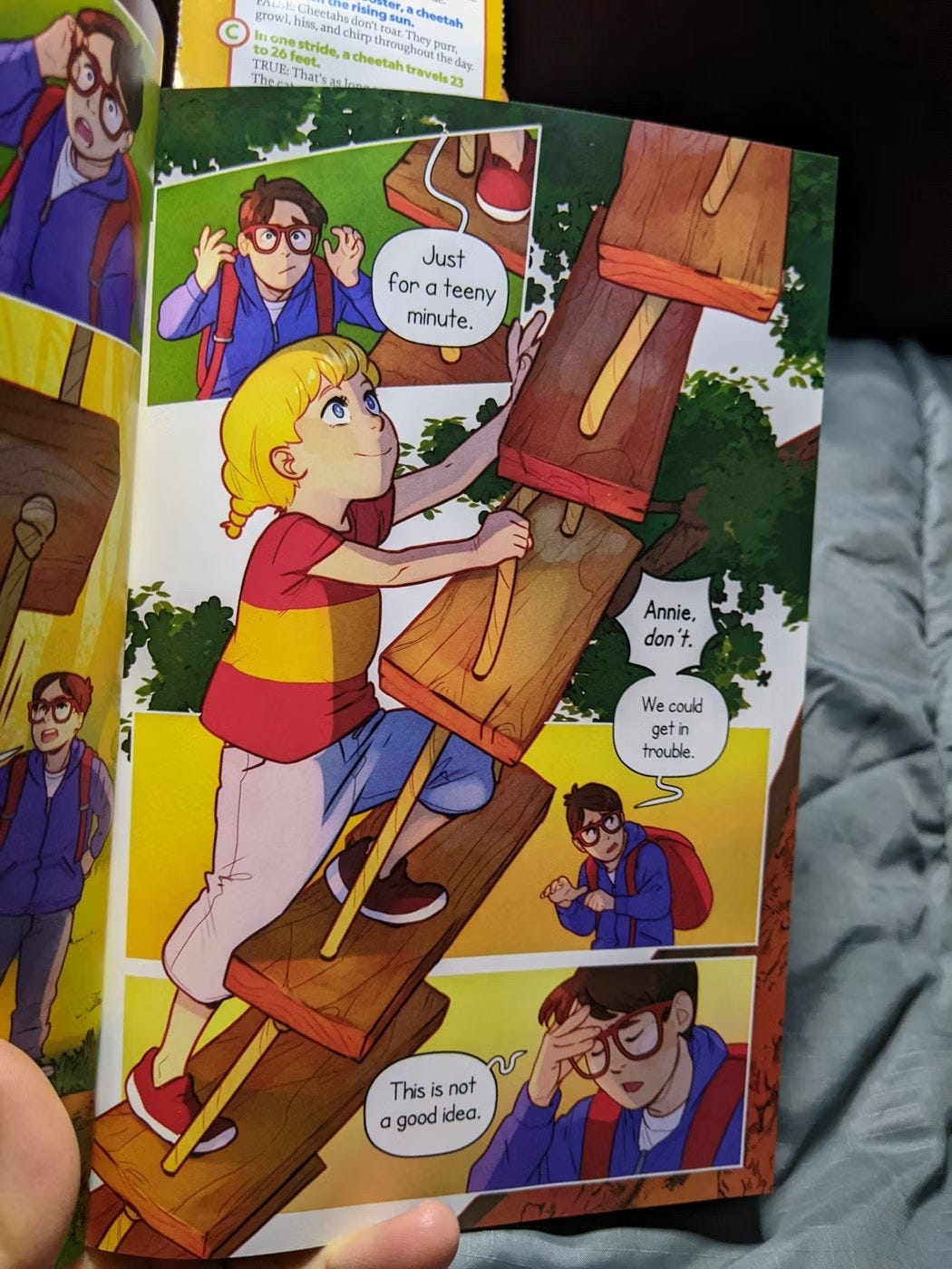
This one is just a nice use of a dominant action in a page overlapping everything else. The page designs itself, and is utterly clear and compelling.
The last thing we see/read is “This is not a good idea” and then the girls foot as she steps forward and up. It’s terrific storytelling.
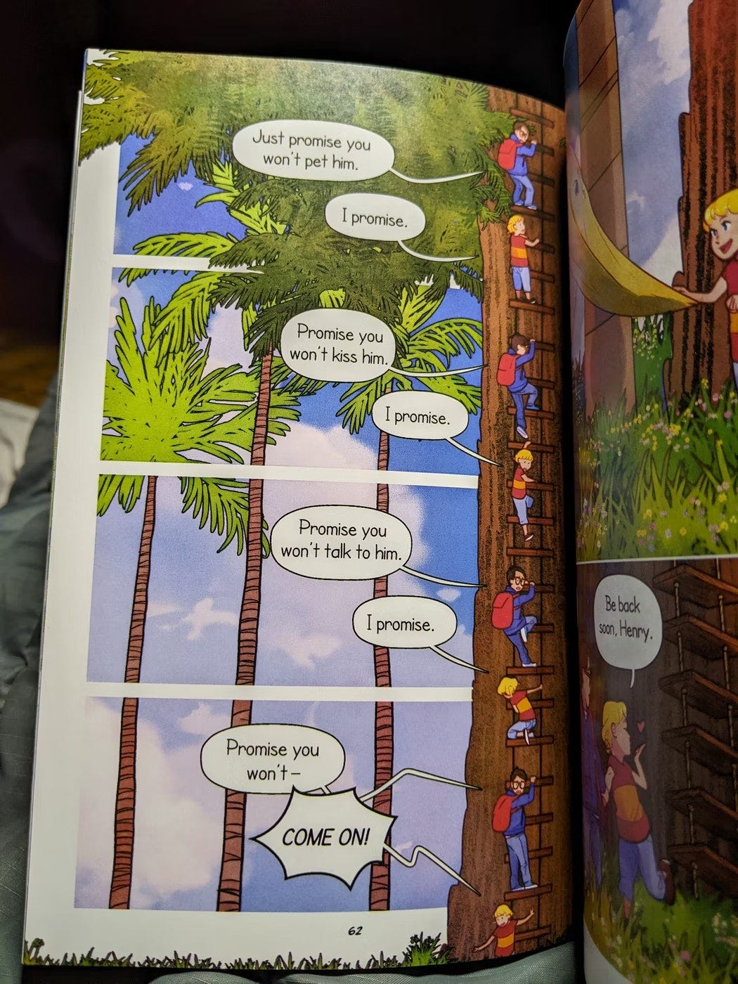
This last one is a great example of what I call "gameboard", which I show in our Year Long Program and Comics for Writers. Basically multiple versions of the character moving through space. It can be really fun, and it is, here. I think everyone should try this at least once.
This version has the really clever addition of four background "panels", which helps us slow down in time. It breaks up four nearly identical phrases into fun individual moments, it lets us watch these fun characters in their unique gestures as they make their way down the ladder while also are in dialogue.
It’s really really great!
Keep your eyes peeled for great storytelling! Share in the comments or in Notes or wherevere! Help us keep on our toes, too!
Thanks for reading!


The slanted panels give me a kinda motion-sickness feeling. Is that just me? 😂
Totally more fun to chit chat about it!!