Last week we looked at Narrative Images. We'll skip sessions 2 + 3 for now ("Time through the panels" as well as an in-depth look at silent comics), and jump to organizing our story on the page.
Here’s Takeaway 2:
How you arrange a page helps tell the story.
Here's part of what we'll look at about organizing our ideas and story on the page.
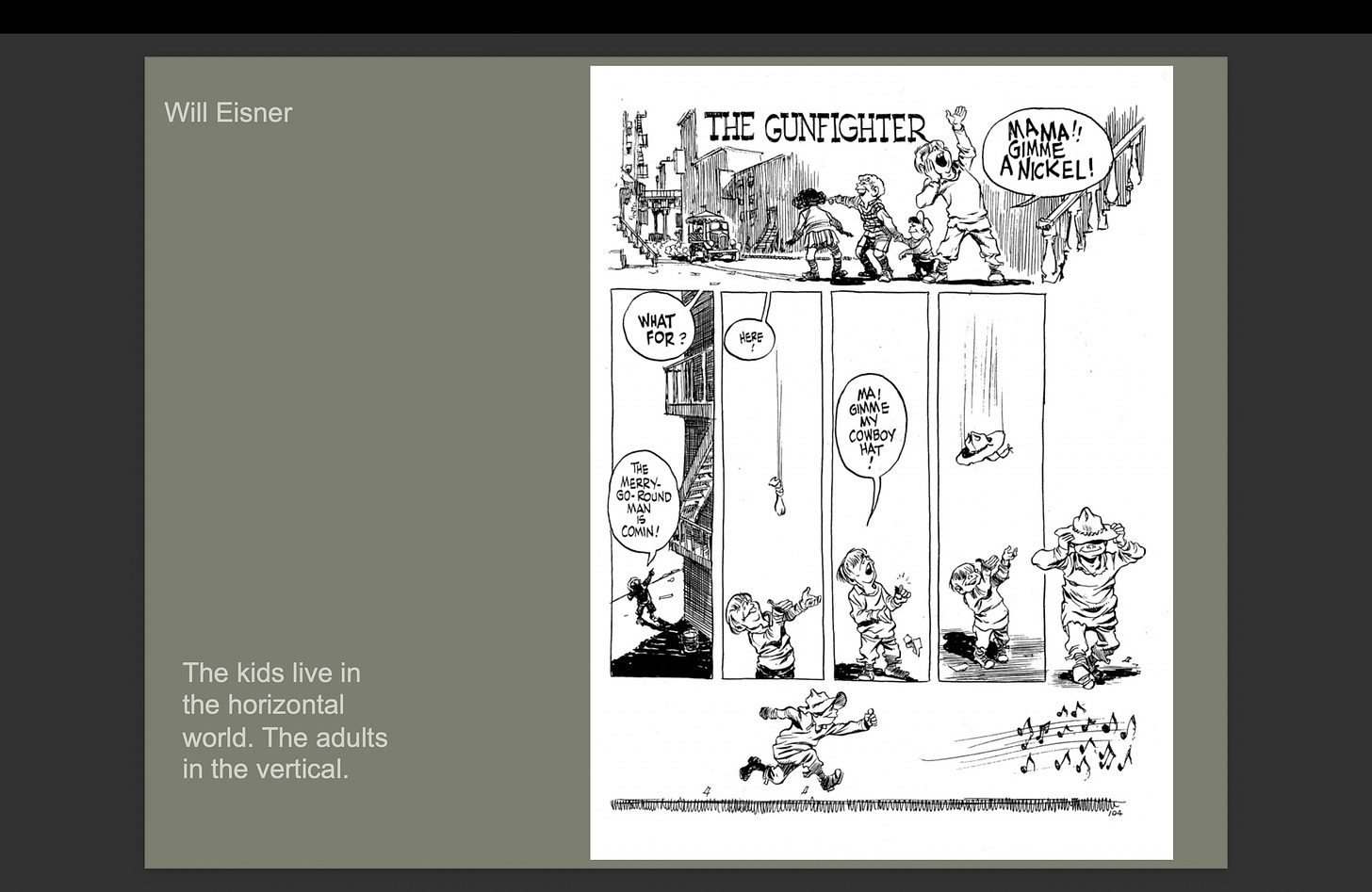
This wonderful page from Will Eisner shows three tiers. One is long and horizontal, the next with 5 narrow vertical panels, then final, another long horizontal.
What he’s shown us the two worlds in this Lower East Side neighborhood: The kids’ world (low, street level, short) and parents’ world (high up in the tenements) and the way objects and speech can travel from one to the other (up and down.)
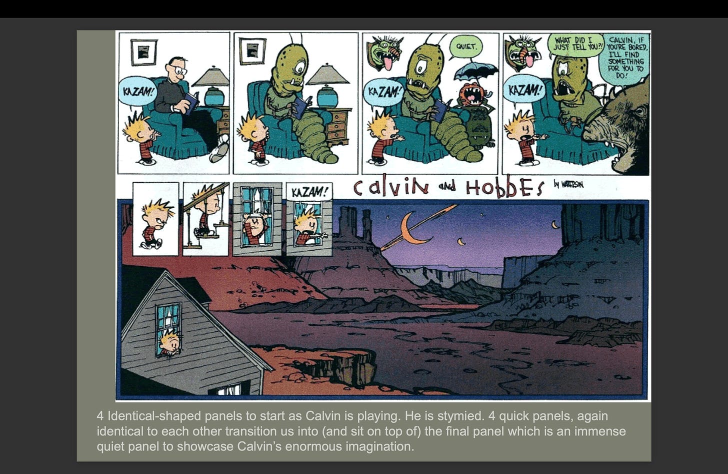
Or this page from Calvin and Hobbes, is essentially three passages, the first on top, a standard 4 squarish panels, all identical and average sized. Time is ordinary here.
The second passage, 4 quick small, narrow panels which serve as a quick scrunched transition between the last, and the next:
One enormous panel reflecting Calvin’s enormous imagination…
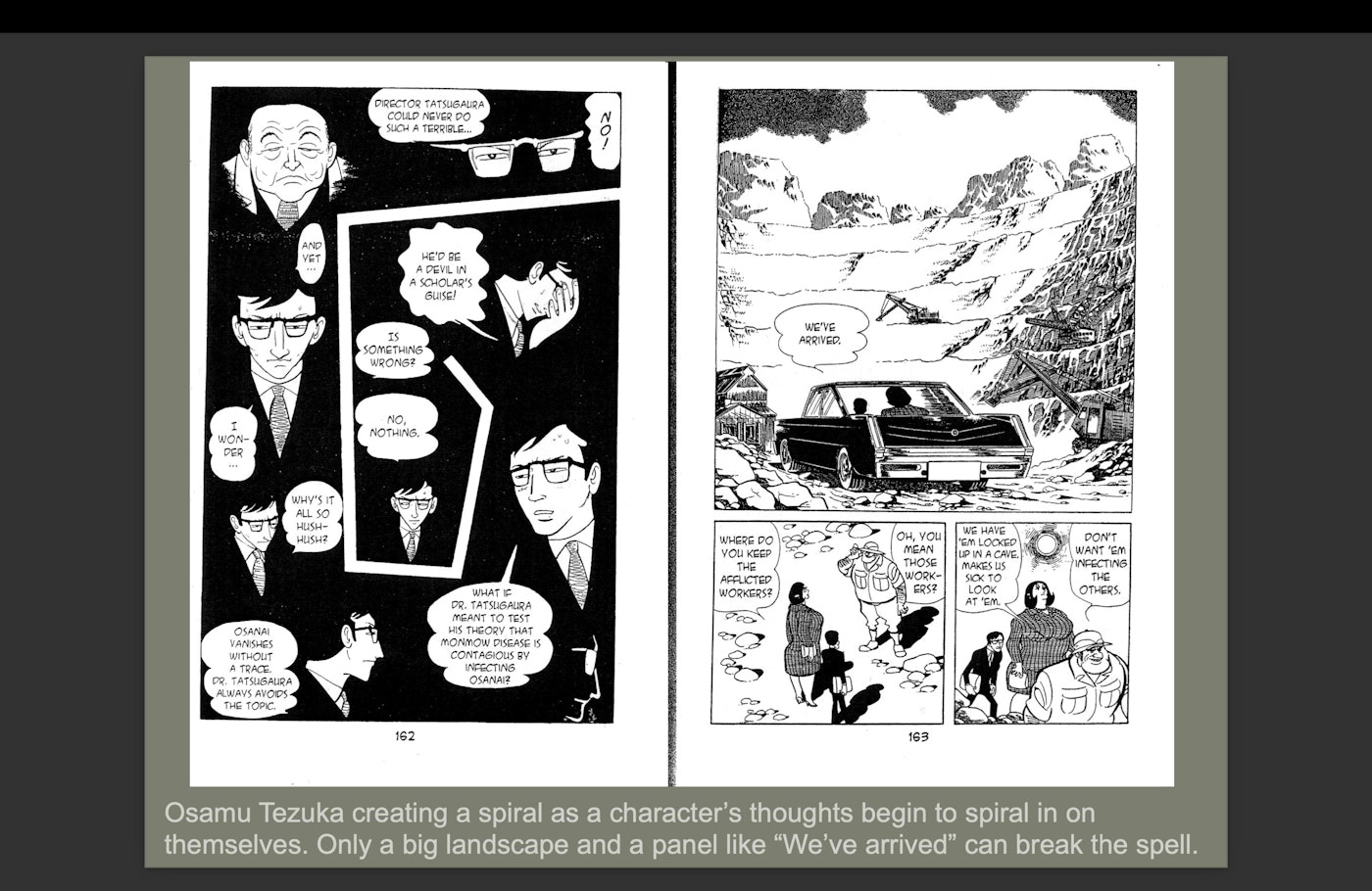
You can really get ambitious with this stuff. Osamu Tezuka here makes a spiral page. We’ll look at this one again later.
Takeaway 2:
How you arrange a page helps tell the story.
Enjoy, and check out the full program at https://learn.sawcomics.org/bundles/online-certificate-program
Want to learn more? We’re doing live trainings of all 18 takeaways weekly in summer 2024.


