Welcome!
I admit I started this Substack as a way to spread ideas and programs we already have at SAW including the Six Month Graphic Novel Development Program and our Comics for Writers course, but I’ve never been a traditional marketer, and I’ve always preferred a community of questioners and learners than a top-down conversation.
Thus, I’ll start with a question, WHAT IS a graphic novel, or, if you’re interested in COMICS, what makes a comic?
There are lot of word/picture combinations that work great, and we can use any or all of them!
Here are some in order of most visual to least:
1 Purely visual.
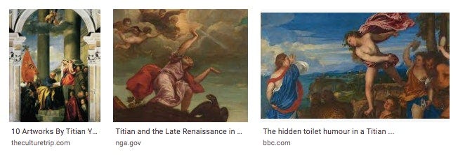
Just paintings in a gallery, with some text on the wall perhaps to help people understand what moments and story you are painting. The paintings are meant to be stared at. Most of the Western world's earliest famous paintings were of Biblical or mythical scenes. Everyone knew the stories already, these paintings helped them visualize it.
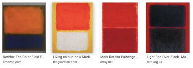
Or on the opposite end, A Mark Rothko painting, which is without story, and just meant to be stared at, and stared at.
The power of these paintings is that they are designed to be looked at for long periods of time, to be revisited, etc. Looking again gives us new emotional gifts. Narrative is less important here than emotion (and sometime intellect, as in the very modern art.)
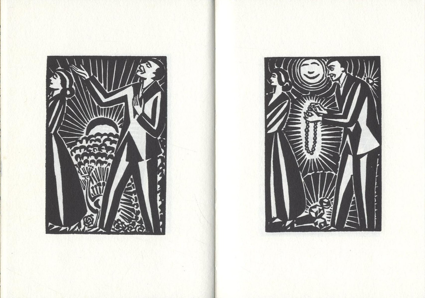
There are also silent graphic novels which sort of work this way. Modern ones like The Flood by Eric Drooker being one, also anything by Lyn Ward or Franz Masreel. They fall somewhere in between 1-2 on this list, depending upon how much story is there.
Images from Franz Masreel's 1924 Story Without Words
Read more here: https://www.fulltable.com/vts/aoi/m/masereel/sww/a.htm
Lyn Ward:
https://www.theparisreview.org/blog/2010/10/13/the-woodcuts-of-lynd-ward/
2. Picture-book style.
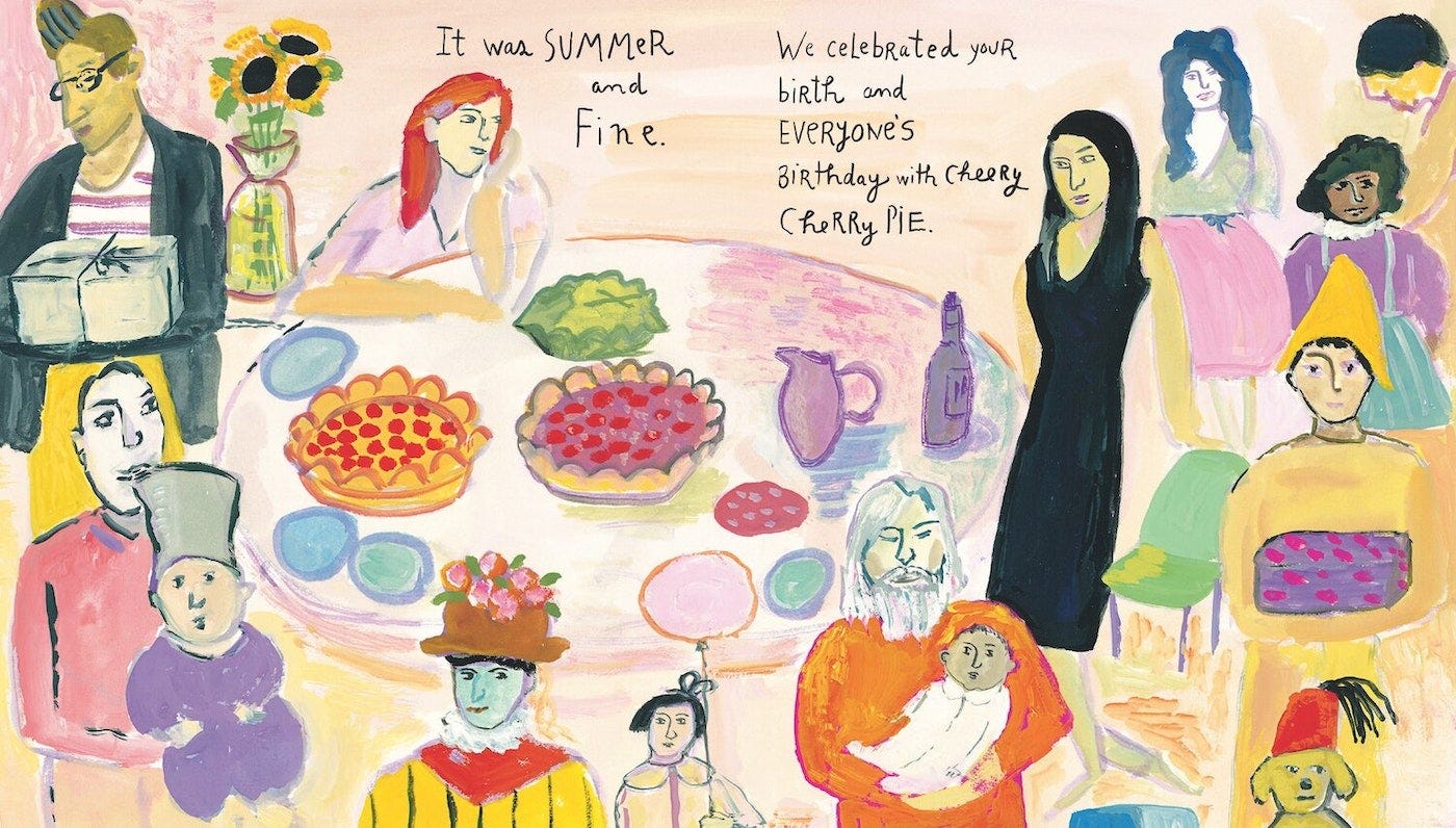
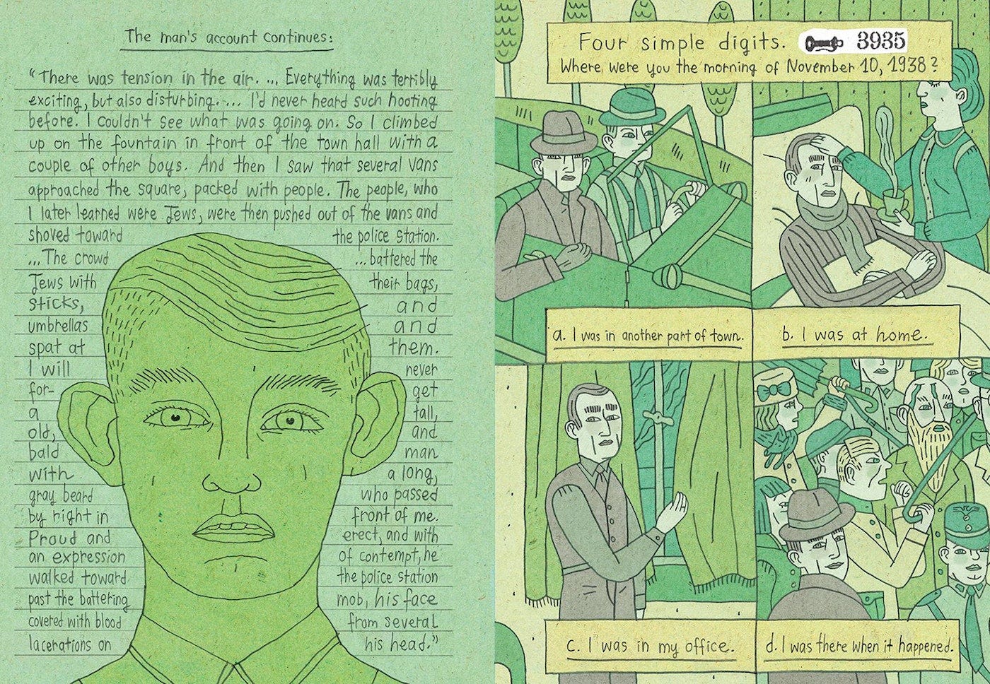
In these cases, pictures carry most of the emotional and dramatic weight, relying somewhat on the strengths of historical painting as described above, and the text is guide to lead the reader from one cool image to the next. The text offers enough narrative to not get lost from picture to picture. The text is as detailed and rich as can be without overpowering the images. Or maybe another way to say it is that the images are very rich, and the text is less so.
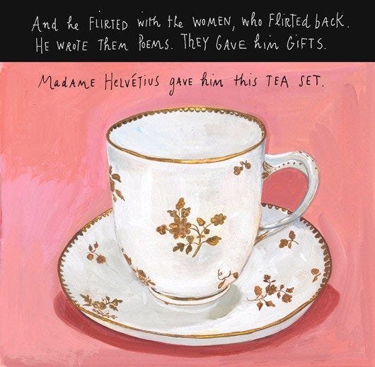
Maira Kalman's work in And The Pursuit of Happiness is a great example of this idiom.
https://www.sfgirlbybay.com/2010/11/05/and-the-pursuit-of-happiness/
https://www.artofthepicturebook.com/-check-in-with/2021/8/13/an-interview-with-maira-kalman
Also Nora Krug's BELONGING is a great modern example.
3. Comic book style.
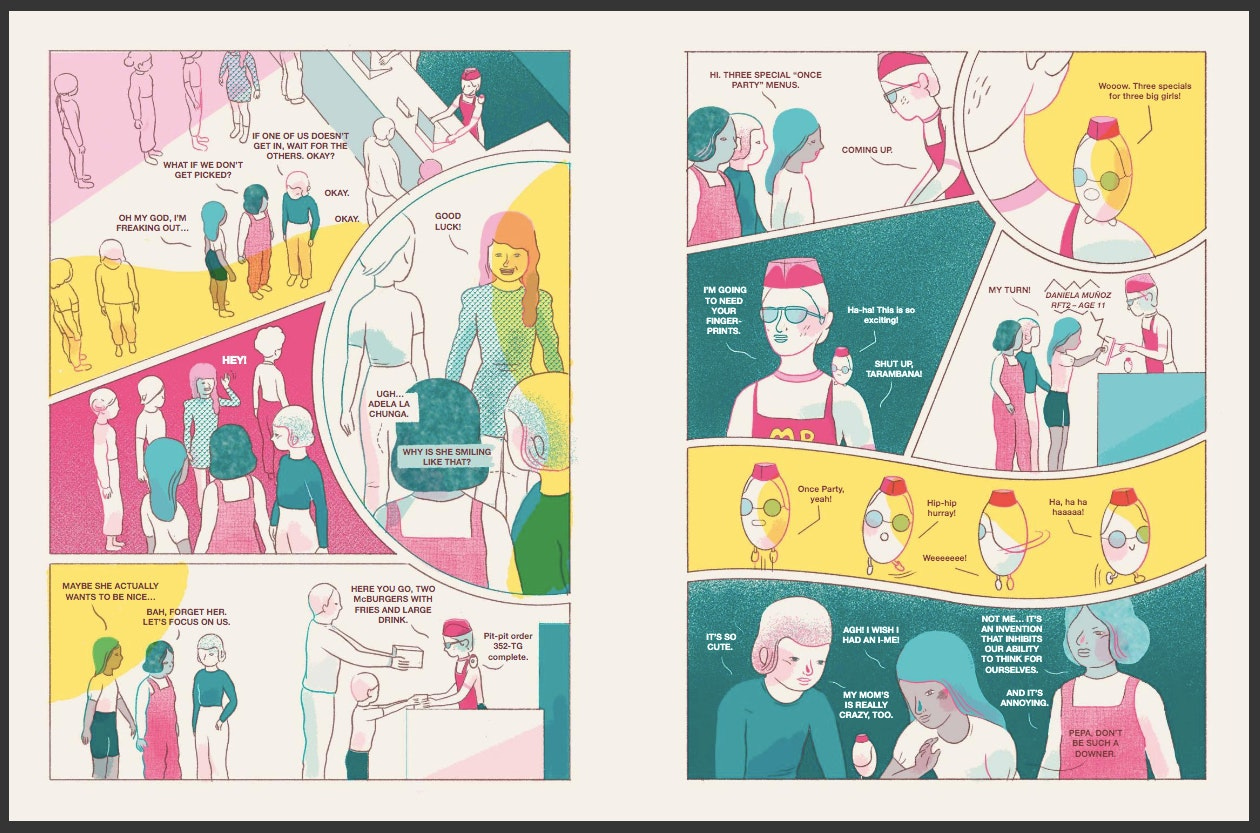
A more even blended version of words and pictures. Most comics we are familiar with. Lots more pictures, more depth in the words and plot, and as much as possible in pictures, but too much intensity in either the words or pictures drags the reader down, so there is a balance to hit. Tries to pull the strengths of #1 and #5 without too dragging it down too much.
4. Mostly text.
I would say some kids books are this way, even Dr. Seuss, though his drawings are lovely, but for instance, The Lorax is really truly about the story and the words and the pictures help us visualize or get the "message" of the story.
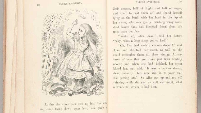
Other examples might include other children's literature like the Moomin Valley books, Alice in Wonderland, or Winnie the Pooh. I'm sure there are adult versions, but I can't think of any right now. But in these cases, the text is the prime driver, and the images guide the reader's imagination. The images are consistent, and do not overpower the drama and characterization in the stories. The images are amazing, but the stories in the text are the main driver of the narrative.
5. Text separate or text only. Obviously, no pictures means the words do all the work, and what is powerful here is characterization, internalization, dialogue, etc.
There are plenty of comic artists who have worked in large stretches of prose, even in their comics.
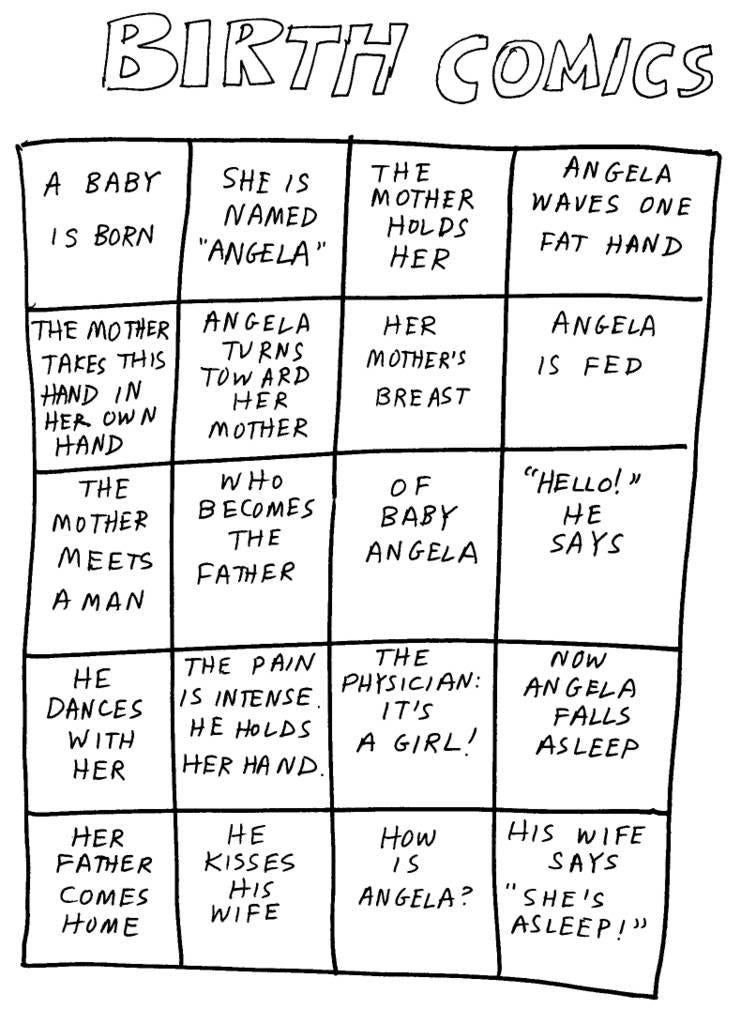
Additionally, there are plenty of writer/artists who made their text visual, to create something more poetic or narrative. Unique rhythms can be created this way.
Kenneth Koch's "Comics Without Pictures" is a great, fun example.
David Lasky does fun things like this too. Here’s a Youtube workshop he gave for us on this very topic:
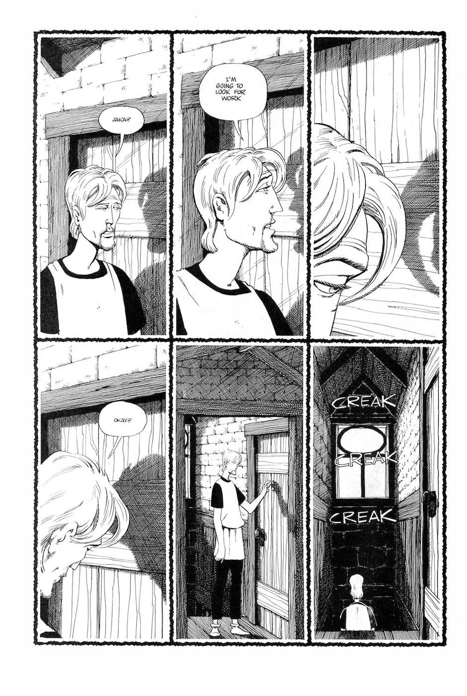
Of course it's possible, even recommended, to experiment with combining. Here, for instance is (the very (deservedly) canceled) Dave Sim with a very-text heavy two-page spread followed by a traditional comic page in sequence.
So, what kinds of word/picture combinations feel right to you? Tell us, show us!
-Tom Hart at SAW






This is a great breakdown for newbies looking to get started. Thank you.