I once had the privilege or writing about single panel comics for The New Yorker blog in 2012. Here’s part 1.
-------------
Look, here’s a cartoon.
Haha!
Our job as cartoon consumers is pretty simple, right? Flip through the magazine, stop and laugh -hopefully often- or sometimes -passively or scornfully- keep on flipping.
But there are details that will inform our enjoyment of the cartoon, details the cartoonist is going to be sweating over in the weeks before you crack that magazine. Your average cartoonist spends tens of hours a week submitting and refining accepted cartoons to bring them to these pages. Cartoonists have to work with expected tools like drawing and gag writing, they have to be able to know what some things look like, and they have to be able to control a pen, brush, marker in a reasonably astute way so that you know what they’re trying to show you. But they also have to control less obvious factors like set design, costuming, character acting, camera placement, as well as a careful and rigorous wordsmithing where appropriate.
As readers we owe these tireless producers of entertainment to meet them halfway, to know what they do. To become intelligent, informed consumers, and where necessary, wise critics.
FIRST IMPRESSIONS
So, what do we first see when we see a cartoon? What we usually see is how it interacts visually with the page- is it dark, white, dense, stark, busy, etc? And then: is the style appealing, do we want to read this cartoon?
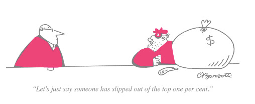
This cartoon by Charles Barsotti is stark, clean and simple. It sits unobtrusively at the bottom of a full page of text, almost telling you that reading it will just take a moment away from your article.
It is in these first instances that we decide we are going to read it, and sometimes even, whether or not we will find it funny. Sometimes we have our favorite cartoonists and when we see that favorite, our gut prepares itself to convulse a little. Yet there may be cartoonist for whom the opposite is true: you find the drawings unappealing or difficult to parse out. Either way, by now, you’ve decided if you’re going to read it or not.
GOING IN FOR THE READ
If a cartoon has maintained your attention this far, then you are now offering yourself up to a whole assortment of cartoonist’s techniques and ideas that he or she has studied and developed to try to directly reach you.
For instance, this brief little Barsotti cartoon offers some advanced cartoon thought and craft to get its simple idea across.
Take a quick look at the solid black areas in the cartoon. The cartoonist knows that high contrast always catches the eye. The more complicated mass of blacks here catches our eye first (probably) and holds our attention as the black mass on the left stabilizes and balances the picture.
Now let’s look at the simple shapes and graphic elements that make up this composition:
A simple stable, largely triangular shape on the left, and a collection of rounded shapes on the right. The collection of shapes on the right signify a variety things about the concept. This whole part of the story is about collection: the mask and hat retrieved and adorned, the money bag stolen, the weapon used and laid to rest,, the drink acquired, etc. Further, just judging by shapes, we see this is a roughly assembled and unkempt man, whose nose has probably had to be rearranged on his face many a time. The man on the left’s nose is sharp, clean and an extension of the shape of his face. The two are completely opposite. Yet the line of the bar connects them literally, and the space above the bar connects them as a shared social space, a space short enough to contain speech, but wide enough to remain a gulf.
Let’s look at the movement our eye makes in the cartoon. It follows roughly along these arrows. If you’re like me, in all one instant, you saw the burglar fellow, then followed the air where the spoken dialogue seems to hang, to see the guy on the left, and looked in the direction his eye and nose are pointing, to bring you back to the burglar, through his arm to the sack of money and back around. Your eye might have started anywhere (maybe the other figure) but the odds are that it took a similar trip once it started.
Note that the empty space could possibly hold this cartoon’s caption. The long sentence can almost be seen there, hovering in the air between the two characters. This width of this space also adds to the idea of the gap between rich and poor so central to the idea.
All these ideas for one simple topical joke about a burglar. But even that statement contains questions: what does a burglar look like? Undoubtedly, not like this. No one looks like this guy on the right, and I’m not sure they ever have. This is cartoon, farcical symbol for robbery, and the cartoonist Barsotti thought it was his best delivery method for the joke, which addresses an issue, which for all its serious implications, is so enormous as to be farcical.
Some cartoons will use these cartoon stereotypes (burglars, kings and queens, stranded Robinson Crusoe-types, etc.) but others will use society’s visual cues, and not cartoon language to make their points.
For instance, this Ziegler cartoon uses some more sophisticated costuming than our above burglar.
Here, we see the balding, stocky middle-aged man in the double-breasted suit, and know he is wealthy and above it all. Double-breasted suits are rarer now than they were say, in the 40s. They are limited to men with older, higher tastes. Similarly, they are drinking scotch or a similar drink which can fit into a rocks glass of that size. We know it’s not a coffee mug- there are no handles, and it isn’t a soft drink, these are too short. These are two wealthy men enjoying the simplest aspects of the elite life.
Note that this cartoon is quite low-contrast compared to Barsotti’s stark, high-contrast cartoon. In this cartoon, the grey washes, absent in the robbery cartoon are the center of interest, but even here, the lone spots of black, in the flowers in the vase, if we follow their lines, lead us to that painting that is the center of interest.
While we’re looking at cartoons about wealth and the financial elite, let’s dig into the archives to look at this cartoon by J.B. Handelsman from 1968:
There are the signifiers of status and time: the three piece suit with light-colored vest, itself a bit of an anachronism now, tells us when we are and who we are looking at. It’s still buttoned even in casual conversation. The man on the left, is angular but wearing the excess fat of wealth of this time. Both are lofty, accomplished and confident men. To accentuate the themes, a third character in the distance surveys the teeming masses below. This cartoon isn’t only about the speaker and listener. The addition of this third, crossing the threshold from a conversing pair to a surveying group, make this cartoon about the entirety of the wealth and power class in our country.
And looking at the formal aspects of composition and contrasts of lights and darks, we see the man on the right entirely framed in the white of the window. The black suits, especially the front two, stand out from the grey environment, and the speaker on the left is very high-contrast: a hot-white face with a dark eye on a dark grey background all sitting atop a black suit. The lines of his nose, eye and mouth, even his hair and newspaper all direct us to the listener framed by the window. The vertical dark areas of the curtains and window frame invite our eye to take a trip to the top and over to the final man, looking out the window. Further, all these strong verticals, including also the lamp, the ornate picture frame and the third man himself, all add to the stability of this picture. This scene isn’t going anywhere. You get the impression if you were to leave and come back 50 years later, these men would still be there, surveying the scene, which in fact seems to have happened.
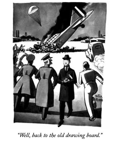
This idea of stability, as well as the lines of direction we saw in the above cartoon all come into play in this classic cartoon by Peter Arno (which gave our culture a common phrase still in use), from 1941.
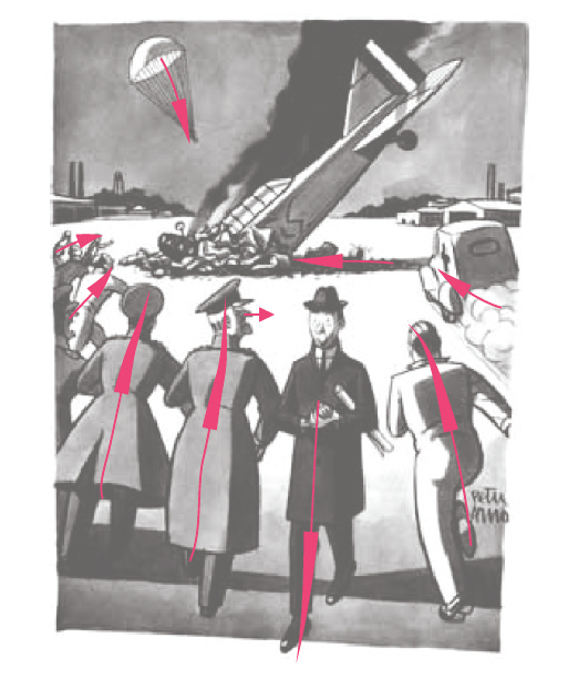
We’ve trained our critical eye to look for high-contrast blacks and whites, as well as to look for the directions that our reader’s eye is being guided around inside the cartoon. So what do we see here?
Note the black shadow, the black plume of smoke and the dark airplane crash on the wide white airfield. Our eye can’t help but see it. Further, every line in the picture is pointing there: workers, ambulance, even the parachuting pilot, all guiding our eye to the center of the story. Except the the engineer, also dressed in black, walking away from the crash and the general, whose body is moving towards the crash, but whose angular face, also surrounded by white, is glaring at the engineer, for while the story is in the center of the panel, the joke is walking away from it. And in a elegant gesture typical of Peter Arno, note how the engineer’s foot has already departed the scene, already carefree, literally out of the panel. Everything down to the smallest detail in the composition of this cartoon is in service of the overall idea.
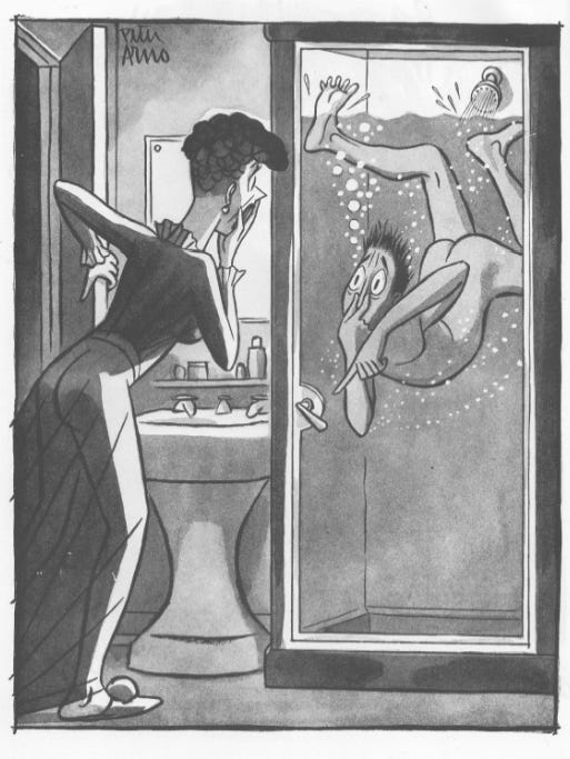
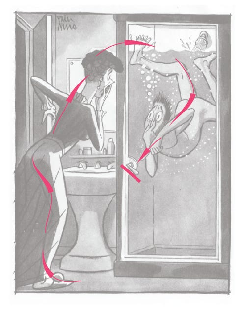
While we’re looking at small details meaning so much, let’s look at this tour de force Arno cartoon, where the tiniest detail, precisely integrated into the composition, actually IS the point of the story.
Looking at the path of our eye in this composition, we see that there is a fluid, circular movement our eye makes which comes to a halt at the lock in the door, as it is perfectly perpendicular to the pointing body and finger of the bather:
This very lock, that were it turned correctly, would both allow our eye to keep moving and also allow our doomed showering man an escape.
In this altered composition, you can almost imagine the saved man and gallons of water spilling out into the empty space at the bottom right.
Thanks for being here! Tell us what you’re working on!
---------------------------------------------------------
Next in part 2: Style and History.
The author wishes to thank and acknowledge a debt to Paul Karasik, Tim Kreider, Bob Mankoff and Mark Newgarden.





this was so interesting and useful, thank you!