Keep characters consistent (or not)
It came up recently about creating characters with a consistent visual look. In other words, making it look the same panel after panel. Do I need to do it?
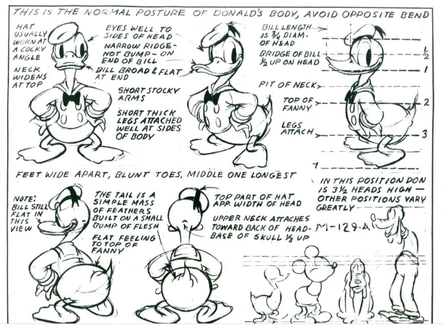
You're going to have to do that if you want this job:
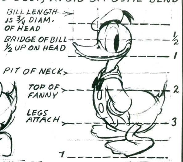
Note how specific we get with proportions down to the fractions...
Mapping this out WILL help you. It's probably one extreme of solving this problem.
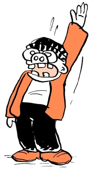
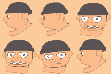
(I'll briefly mention that I never bothered to do this for my own signature character,
until 5 or 6 years after I created him, when a friend/fan sent me this computer animation...
I realized I never thought about what he looked like from the side before that!)
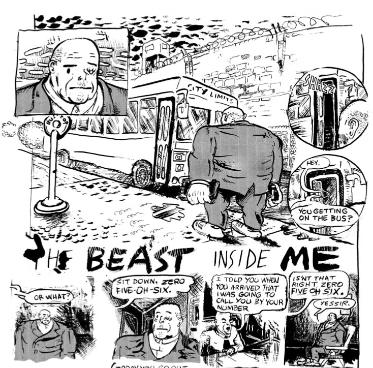
The other extreme to getting it all perfect is not caring at all. This can be done successfully. Josh Bayer is one of my favorite cartoonists, and his characters are all over the place. Note this first page from a recent comic:
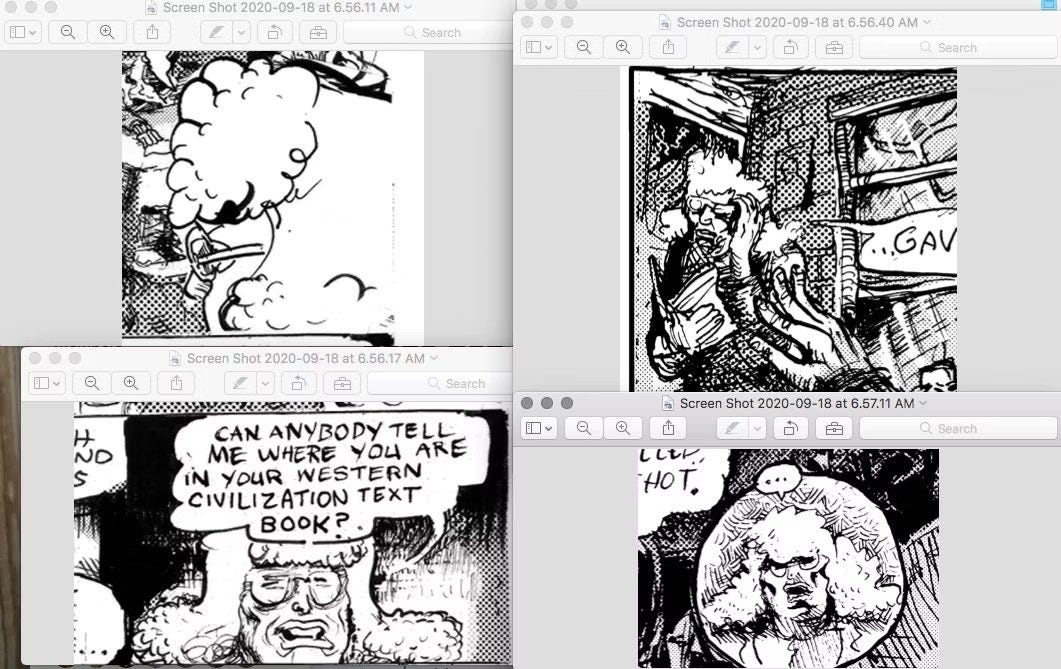
This character has a far tinier head in panel 3, it's roundish in panel 1 and squarish in panel 4. Low neck in panel 2, high neck in panel 4. Long face, sometimes short, etc. Or here is a substitute teacher from over 2 pages...
He's clearly having fun with her hair, letting it reshape itself panel to panel.
But the hair is a clear marker of who we are looking at. We don't slide out of the story, we know it's her, we watch her physicality alter a little from panel to panel but we totally believe it is still her, likewise the bald guy up above.
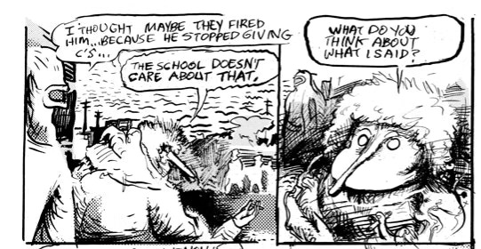
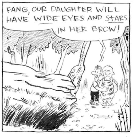
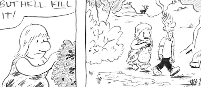
The idea of a "marker" is a good one. If your characters look sufficiently different, and each has an identifying "marker" (black hair vs light hair, short vs long, etc.) you should be fine, depending on your goals.
Another example of this marker is Josh Bayer's character here. He's always drawn with this long mosquito-like nose. You never miss him, even though his proportions change from panel to panel.
So those are the two extremes. Get it perfect or don't worry about it, and just help the reader out.
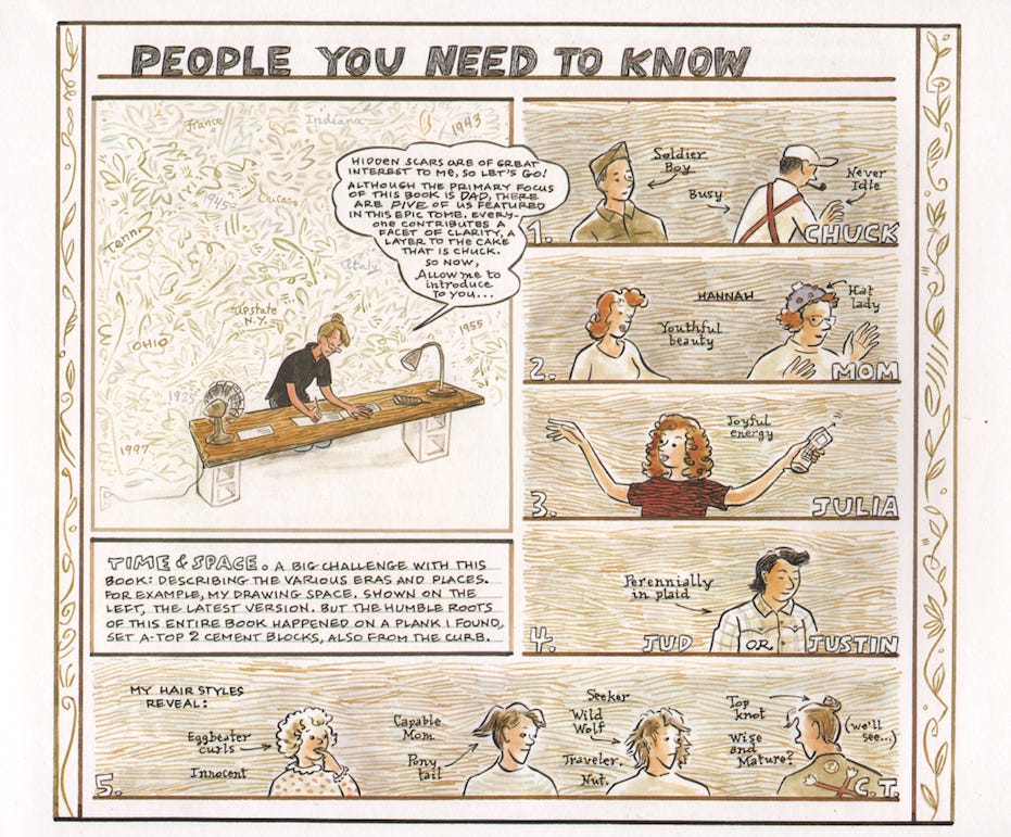
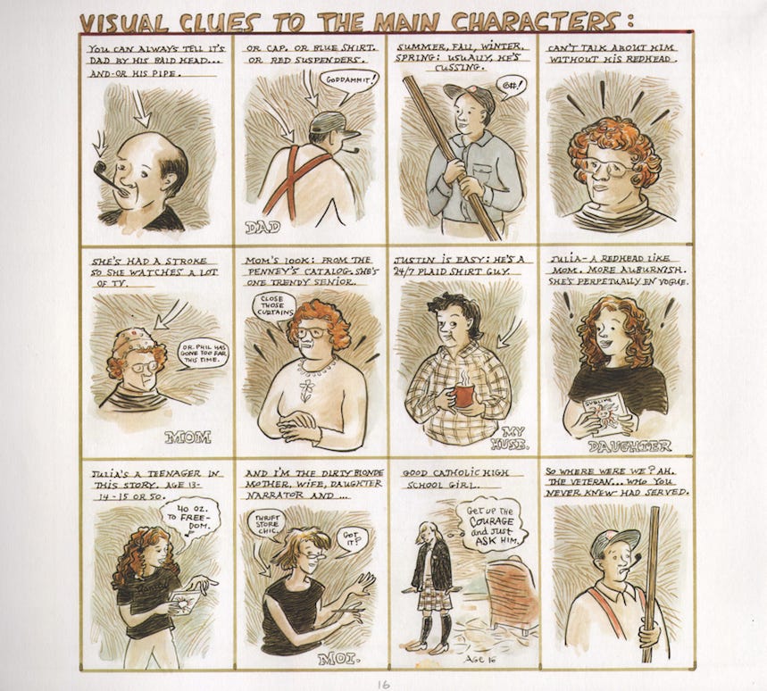
Here’s another example, from Carol Tyler, "You’ll Never Know” (also known as Soldier’s Heart.)
Here she introduces the characters, tells you how to visually identify them and how to identify what time we are in in the story…
In between is probably where you will land, as I am. I am ALWAYS wrestling with "what do my characters look like?" I never settle. I try.
Right now, I've been getting the the woman character in my story right and wrong, off an on.
I'm pretty sure she looks like this, here's a small version.
And she changes a bit here and there. Here are two slightly different looks.
Her head is a little more squashed in that first one. I'll probably leave it.
But below is one example where the difference is too extreme and I will have to change it later:
The first one is wrong, too round and long. She should look more like the second one, so I will change it later...
So in short, it's a contract you make with your reader: how much do they expect consistency and how far are you will to go? Some readers are hard to please- others will welcome your guidance, others are are happy to see your artistic fluctuations.
Have fun!
-Tom Hart
Thanks for being here!


