Oh no, PERSPECTIVE!
Some simple ideas about perspective, with student Beverley Kort.
Perspective in Comics is sometimes hard to grasp at first. It’ll take some time for some, - but it always takes a lot of practice…
Tom Hart went over some basics of One-Point Perspective with student, Beverley Kort (see her web presence here) , in the SAW Online Year-Long Comics Certificate Program.
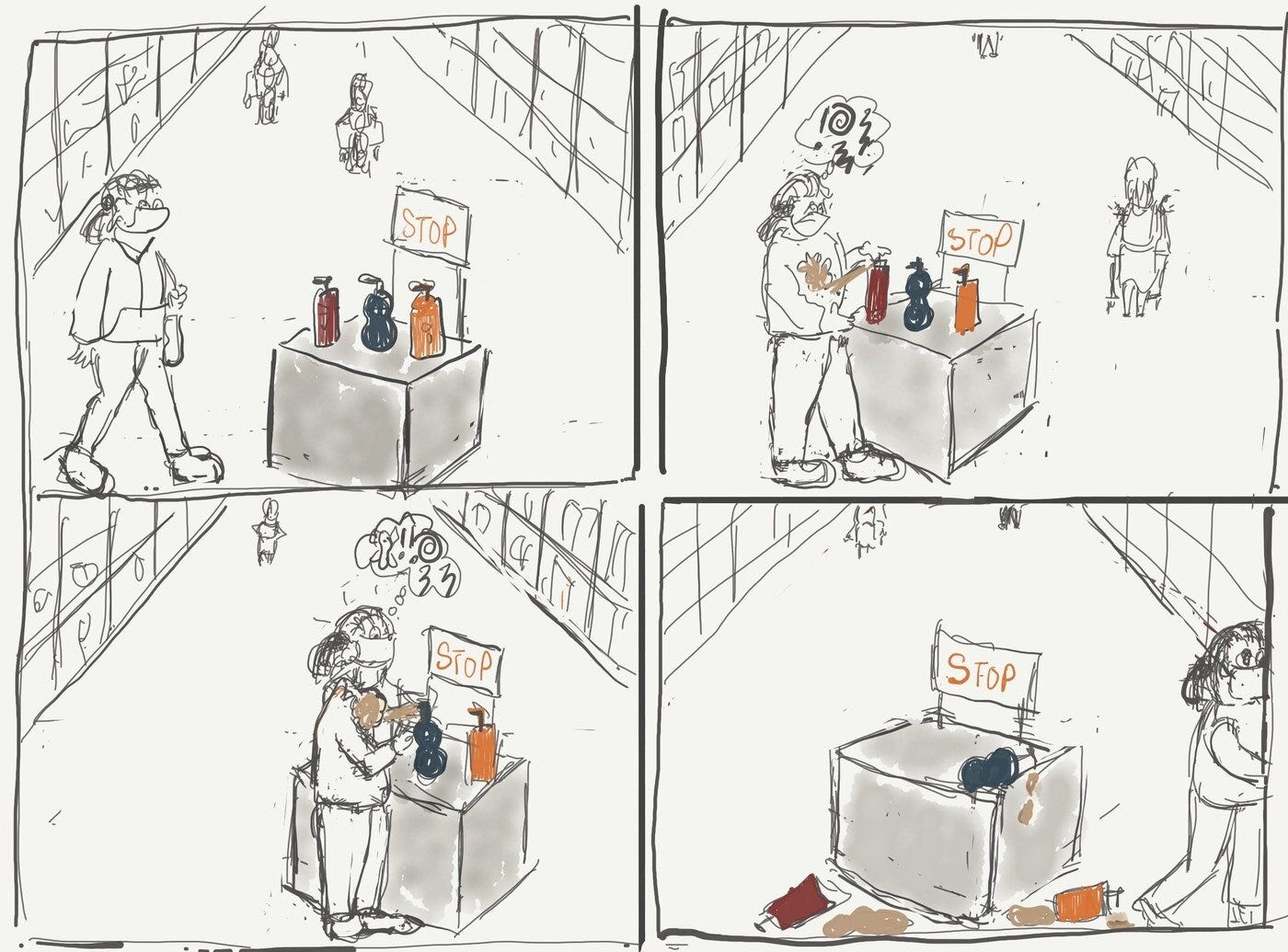
Here’s Beverley’s comic example for reference:

This is a great and hilarious comic, and a brilliant attempt at One-Point Perspective.
Tom Hart writes back:
“One thing worth noting about One-Point Perspective (which is what this store is rendered in), is that rarely do the actual spaces of an interior converge so tightly in real life as they do in the upper part of your drawing.
Why? Because these lines converge in real life hundreds of miles away at the ‘horizon line.’
(Think Kansas, or the ocean.)
It's tricky to get used to this.
So, when rendering groceries stores, etc. we need to realize we would really only see a small sliver of the the converging lines.”
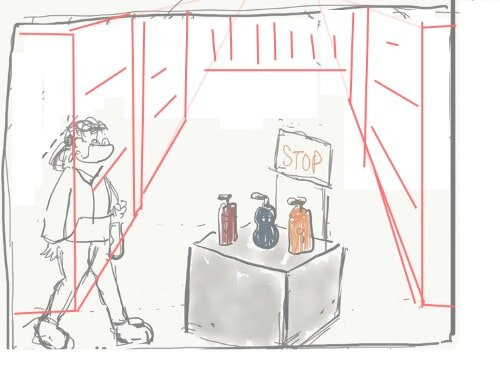
Here’s another look.
Notice how if I extend the lines towards us, the viewer, and then place more of you there, there is room for 7 of you, to be walking in full stride.
Since this is extremely rare except at like, Home Depot or something, we've started with too wide a spacing of our aisle.
Digression--- if you look at that drawing, you see the high horizon line, but the drawing of you is FLAT, as if the horizon line is somewhere in the middle of your body.
This latter situation is common and normal. Peanuts works that way, and tons of other comics, cartoons, etc.
Notice how in a flat drawing like Charlie Brown here, the horizon line cuts somewhere through his body.
If YOU were in the same space seen realistically, with the same high horizon line, we would see the top of your head, the top of your shoes, etc.
So it’s not a big deal, but worth pointing out, that in your drawing at the moment, there are two horizon lines. One at the top of the image, and one cutting through your body like Charlie Brown.
I'm still trying to get that aisle right, so let's move on.
So one thing, in a panel like this, where we have accidentally drawn stuff too close to the vanishing point, we can do a quick fix by shortening the things we are drawing. So let’s CUT this aisle.
See above and below.
But even still, the perspective is a little funny because notice we see the TOP of the table (correct, technically) but you from the side (technically incorrect, but still fine if you want to run with it, a la Peanuts.)
So still going for a quick fix, if we lower the horizon to some sort of compromise between high and straight through your body, it's probably something more like this...
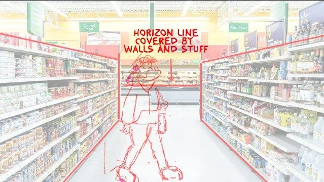
Quick search for grocery store inside in google photos brings us this (see above). You can see a lot of perspective in this photo.
I drew on top. it's got a super low horizon, more in keeping with your placement of yourself.
Note the horizontal line where the cooler/case meets the FLOOR here is NOT the horizon line, it's merely the wall or other part of the store..
The faint lines from the aisle continue to a slightly higher horizon.
So this drawing is a little closer to accurate, but it doesn't have the front of the aisle, so I'll try to find one that does.
Aha…
This one is ok, and a good demonstration of the perspective methods we use at SAW, with head heights* and all that.
I made your drawing of you a tiny bit smaller here and now you cross the horizon line at the eyes. The man crosses at the neck. I can't figure out why the woman on the left is so low, she might be quite small, (or perhaps there’s a tiny distortion…? Or maybe I’m totally off base :))
But now we see a more accurately designed grocery store picture. Notice the vanishing point DOES exist within this image, but we can’t see the literal point. It is behind countless walls, and cars and buildings and other things outside the grocery store, etc. But it exists as a place to keep in mind help us identify the where everything converges.
Whew! I’m going back to Peanuts!
- Tom Hart on One-Point Perspective. Thanks to Beverley Kort, see her work in this book here!
Order here.
One-point perspective is only a glimpse into the world of perspective in comics.
Do you struggle with perspective in your comics?
There’s a lot to learn and we’ve got a ton of resources on it for you to be the best perspective connoisseur you can be.
For more intensive comics learning with teachers at SAW, check out *SAW’s Year-Long Intensive Program
Thanks for reading! I promise next week will be fun again!


