In part 1, we looked at panel composition. Read that here.
Here’s PART 2, about style and history
STYLE
So we’ve seen how composing a picture’s elements in space, and how the use of high-contrast areas guide our eye, and how our own social awarenesses come into play even when we merely look at a cartoon, but what about style? Great cartoons aren’t just combination of idea and image, but idea, image, plus the artist’s individuality tilting all of the elements into a unique focus.
Roz Chast appeared in the New Yorker in the early 1980s and instantly became a reader favorite. What Chast brought was an intense nervousness, a comedic take on modern anxiety similar to Woody Allen or even Mel Brooks who were popular at the time.
Let’s look at this simple recent Chast cartoon:
These characters are all horribly tense, each one of them a pubescent monstrosity. Worry and tension wiggle out of each one of them. Chast traffics in worry and self-conscious tension. Her characters are always anxious, always on the wrong end of their own story. It’s hard to imagine Barsotti, cartoonist of the calm burglar, drawing this image, just as much as it is hard to imagine Chast drawing a robber relaxing after a heist. In fact, I don’t think Chast has ever drawn anyone relaxed, ever.
Certainly not this guy:
Chast’s lines are coarse, inelegant, hurried, but perfectly appropriate for the self-conscious dolts and worriers (in other words: us) whom she draws in her cartoons. She is popular because she reminds of us our worst selves, but brings it out light-heartedly, and lets us laugh at our worst fears and neuroses.
Chast brings to mind at least one other trafficker of anxiety who has been with the New Yorker since the 70s, George Booth.
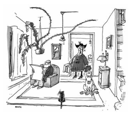
Booth is partially famous for his frantic and pathetic dogs, but also for his married couples living in cluttered hovels full of obscene pets, strewn litter, bare bulbs and puddles of bath water. His domestic drawings are purposely absurd, and his compositional tools: shades of black, white and grey as well as the guiding directional lines we saw in Arno and Barsotti, are there, but leading you everywhere to drink in the entire scene at your own pace.
Here’s one from 1992 [3/16]:
A loopy household of insane inhabitants, from the wild-hatted wife to the puzzled and scornful husband to the stunned dog to the out of control pothos plant hanging from the ceiling (some sort of desert/tropical hybrid, it seems) to the hairy unkempt cat. Booth’s cartoons always feel like you are being plunked down into the center of an ongoing drama amongst crazy people, and if you are honest, you recognize yourself in those crazy people. It’s not far from what Samuel Beckett did, in creating his terse dramas about forever going nowhere but eternally discussing it. Booth’s staging and dramatics were often so rich you could almost put any caption beneath it and achieve some effect:
“Let’s just say that someone slipped out of the top one per cent.”
Or:
“I feel an intense pride, Robert, that I live in a country rich enough that can have war and peace at the same time.”
We are affected by each cartoonist’s style, and some make their style more a center of attention. For a cartoonist like Booth or Chast, the way in which they draw is more than half of the story, the nervous, anxious, stunned characters are the joke, because they are us, anxious and stunned.
Other cartoonists have rich styles, but maybe don’t traffic in anxiety as much as they create an interesting, drawn environment to investigate or settle into. Edward Koren is a great example. [1995]
The characters in this cartoon are speaking about urban worry and Koren’s short sketchy lines might be utilized as anxiety in another cartoonist, but in fact, there’s a contentment here.The speaker is sitting calmly explaining himself and the listener seems like she willing to waiting things out.
There’s a calm inside the wild in his drawings, as if we’re looking at a nature documentary but a placid one. Koren’s long-nosed characters look a little like birds and they live in cartoons that look like nests.
A recent example uses this style to excellent effect:
This caption could have been drawn by any cartoonist and still have been funny, but Koren, with his lines skittering throughout this office environment turn the man’s “bonding” here into a sort of nest-building.
Koren’s style is organic; his style is an extension of his ordinary behavior. I’m guessing if you looked at his phone doodles or at quick travel or location sketches of his, they’d look a lot like his cartoons. I imagine he’d draw the exterior of the Taj Mahal covered in his hairy lines because that’s how he sees.
Personality of the cartoonist, then, adds to our enjoyment of the cartoons.
HISTORY
One last way in which we can bring more awareness to our cartoon-reading is by knowing some of the medium’s and the magazine’s history. A recent Bob Mankoff cartoon commented on the TV speak about the Affordable Health Care Act as it was being argued in front of the Supreme Court:
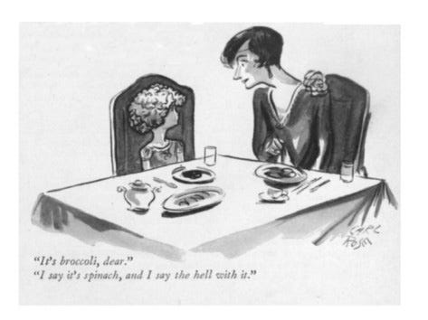
A pretty funny line and cartoon, rendered in Mankoff’s unique, mannered style. But those that have seen some of The New Yorker’s classic cartoons in its 8 decades might have been reminded of this one, by Carl Rose in 1928:
This riffing on classic works happens in all media, especially in transient ones like pop songs or weekly cartoons. Here, Mankoff’s joke stands alone, but the reader who knows the original gets an additional surprise, an additional layer of humor, and the reward of sensing newness and familiarity in the same moment.
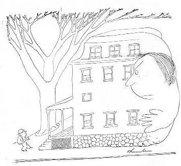
Then there are the unconscious borrowings, also common in any rich medium. Did Zachary Kanin, when offering this recent cartoon about real estate:
consciously recall this Thurber cartoon from the 1930s?
Maybe, maybe not. But when we as readers sense this subc
onscious echo, both jokes become more complicated and resonate with each other through the decades.
And when we bring our intelligence and understanding of how cartoons work as we meander over the page to each new cartoon, then we can participate in a richer experience than merely chuckling where appropriate. We become conscious participants in a large, shared levity.
---------------------------------------------------------
The author wishes to thank and acknowledge a debt to Paul Karasik, Tim Kreider, Bob Mankoff and Mark Newgarden.


love the thought about the particular personality the cartoonist’s style brings!